St. Patrick’s Day has become big business in the sports fan wear industry. It has become commonplace for teams across sports to eschew their traditional colors for the day and promote green and white fan wear and jerseys. All levels of professional hockey have been the biggest to jump on the trend, with special fanwear for sale and given away at games, and special jerseys worn for games played around March 17th. The following are three shirts that caught my eye for various reasons.
NHL: St. Louis Blues
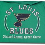
Last night, th e St. Louis Blues mixed their St. Patrick’s Day commemoration with environmental awareness, and gave away a “Green Game” t-shirt to all fans in attendance (quite a risky claim to advertise – from personal experience, you should always give an exact number of giveaways, a la “first 5,000 fans”). The shirt giveaway was sponsored by Monsanto, a Cambridge, MA based agricultural innovation company with an emphasis on sustainable practices. This was the second year for the Blues promotion.
Shirt Grade: B I like the muted, antiquey kelly green shirt and faded style of the print. It also helps that the Blues’ team colors happen not to horribly clash with green. Kudos for using that to their advantage and not changing the logo’s colors for the holiday’s sake. Environmental awareness initiatives during games are the new “it” thing to do in sports marketing – trust me, I participate in one – but the giveaway needs to be backed up with sustained, but subtle, green initiatives, otherwise it is just a t-shirt giveaway.
AHL: Wilkes-Barre Scranton Penguins
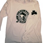
 The Baby Pens (speaking of, we are long overdue for an edition of The Everyone’s Favorite Goalie Watch, but that’ll be another post) are selling two St. Patrick’s Day long sleeve shirts in their online store. The 2009 edition ($20) features their mascot, Tux, skating with a four leaf clover in the background on the front. The back reads “Happy St. Patrick’s Day.” The 2010 version ($22) features the logo in what appears to be a very dark green (nearly black), with a four leaf clover on the sleeve. Long sleeve shirts are always key in that part of Pennsylvania, where the damp gray chilly days seem to out number any other weather.
Grade: C The effort is there, but the execution is not. The 2009 version is too campy, and the 2010 version shows promise, but the green seems too dark. Kudos, however, for the 2010 edition’s four leaf clover on the sleeve.
ECHL: Gwinnett Gladiators
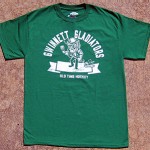
 The ECHL Gwinnett Gladiators teamed with Old Time Hockey, the same Salisbury, MA based company who partnered to create some of the NHL’s 2010 St. Patrick’s Day gear, to create a green t-shirt to sell this March. The shirt ($20 with free shipping through today) features a rather disturbed and surly looking leprechaun brandishing a hockey stick, with a small Gladiators logo by his right foot. The all-caps font is rather 1950s style, and arches above Surly Leprechaun’s head.
Grade: A This is the first ever St. Patrick’s Day shirt I would ever consider purchasing, and not just because I’m in the market for a shirt from the team where two of my most favorite former BU hockey alums play. What sold me was the 1950s fonts – I’m a sucker for fonts. Plus, I feel like Surly Leprechaun is going to hurt me with that hockey stick if I don’t like the shirt.
ACR5GWEKYTEQ
Hi a novice to http://www.sportsgirlkat.com and loving it so far! I’m a CMO(Chief Advertising and marketing Officer) . Not Positive of a post in this but I’m searching for firm that could
grow our sales on the internet like how forums get visitors in huge nubmers. I think its wonderful on how numerous members and visitors
these forums get. Any suggestions of firms that you’ve used could be fantastic.