So you want to post a link on your company or organization’s Facebook page. Did you know that you don’t have to include the long URL in the body of your post? Thanks to Facebook’s preview functions, there is no need to keep that ugly looking URL (even if it is a shortened link) in the text of your post. Plus, you can customize that preview to make it much more attractive to your audience.
A few months ago, I made a quick two minute YouTube video showing how I always make sure to delete the link, and then use Facebook’s options to customize the post’s preview. Take a look. If you aren’t in a spot to watch a video at the moment, some tips follow below:
Kat’s Facebook Page Post Tips
First off, just delete the link in the body of your text. It’s a pet peeve of mine, and it just looks repetitive. Some reason that the need to keep the link or at least a shortened version to ensure they are getting the tracking information from that link. Even if it is a shortened URL, keeping that link is not worth the awkwardness of how that link looks in the post. If you are using that shortened URL to create the Facebook post, you should still get the insights. Or, you can make the most of your Page Insights to see how much engagement (aka, people going to the link from your post) your post is getting.

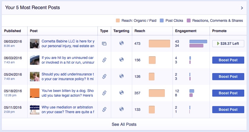
Here is an example of the Facebook link insights on a page I manage. It gives me my Facebook specific clicks.
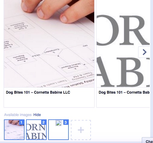
Customize the image that appears in the link. (I reference this as “a topic for another day” in my video. I will eventually make a separate video about this, but until then, I’ll explain it in text.) Unless you are showing a gallery of items, you don’t need to use the gallery option for images, which Facebook seemingly defaults to if you have multiple images on the page. Just click on each image to delete each one from your preview.
You can also choose an image separate from the ones Facebook automatically pulls from the link. I like to use a service like Canva or (if I am feeling especially creative) Adobe Illustrator to create an image that fits Facebook’s ideal image dimensions (940×788 pixels.) You then upload it via the dashed box with the plus sign you see at the bottom of your link preview. That keeps your image from being cutoff awkwardly.
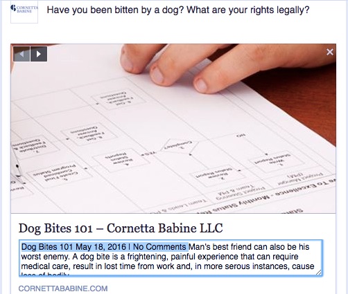
Take time to customize the preview of your link. I think this is especially important if you are a news source or blog sharing your links on Facebook. The Facebook link preview will just post the first few lines of your post cut off at a random point. It will also include information like the date. You don’t really need any of that in your preview. Plus, instead of giving your reader the first lines of the post that you want them to visit, why not tailor that preview to a summary that will pique their interest?
Facebook is so mainstream that users now have high expectations of how a professional organization or business will use the service. I think making sure your posts are neat and not repetitive will lend your Facebook page further credibility, and eliminating the URL and customizing preview options will give your page that leg up.

